To Attract Crowdfunding, Mystify Them With Your Logo

It’s been well documented that the design of a label or logo can play a big role in shaping what people think of a brand and whether they buy (Luffarelli et al., 2018; Stamatogiannakis et al., 2015). As it turns out, something similar holds true for entrepreneurs and innovators: a complex-looking logo may help attract investors via crowdfunding.
Our study, entitled “What’s In a Logo? The Impact of Complex Visual Cues in Equity Crowdfunding” and published in the Journal of Business Venturing in 2018, looked at how logos influenced how potential crowdfunding investors perceived different ventures and how much they actually invested. Our findings suggest that many potential backers see complex logos as a signal that the venture is innovative and invest more money as a result.
The Magic of the Subliminal
While studies – including ours -- have looked at the impact of logos on consumer behavior, no study has looked at their role in equity crowdfunding until now. Our findings build on established research about how visual cues can attract attention and influence decision making. For example, research has shown that when confronted with a bewildering array of choices and information, buyers use mental shortcuts – called “heuristics” – to help them decide (Baker and Nofsinger, 2002; Gilovich et al., 2002; Hirshleifer, 2001). As experienced marketers know, a logo or label sends subliminal “signals” to the would-be buyer (e.g. Sundar and Kellaris, 2017) and dynamic (Cian et al., 2014).
It is well established that the highly trained and experienced institutional investors at venture capital and investment banking firms, as well as the more sophisticated angel investors, do a deep dive into the performance metrics and histories of companies seeking their funding. Depending on the stage of the company, they evaluate the overall market opportunity, whether the company has attained patents, its financial performance including a revenue stream, the experience of the management team and who else if anyone has invested previously. In the crowdfunding world, where thousands of investors are looking at thousands of ventures and may not have sophisticated tools to judge their potential, visual cues like logos may have an impact on people sifting through their options.
Complex images take longer for the brain to process. Complexity can emanate from different design characteristics. For instance, visuals that have more dissimilar elements or that have more intricate images or visuals with many colors instead of a monochromatic scheme are perceived to be more complex. So, the difficulty in processing complex logos creates an impression of originality and novelty, which might lead investors to believe that the venture is more innovative.
Our Methods
We conducted three interrelated studies to arrive at our conclusions. In the first study, we recruited 2,630 respondents, including likely crowdfunding investors, through Amazon Mechanical Turk, an online survey tool. We asked each respondent to judge two logos from actual companies seeking equity crowdfunding; a total of 174 companies were evaluated overall. Half of the respondents were asked how innovative the venture appeared, based on their logo, on a likert scale of 1 to 9, (1 being not innovative at all and 9 being very innovative). The other half were asked to rate how complex the logo appeared to them, on a scale ranging from not complex to very complex on a likert scale of 1 to 9. The latter group also was asked to rate the logo in eight descriptive characteristics, including symmetry, roundedness, depth, orientation and others.
The second part of our study looked at 10,611 actual investments made by 5,427 backers across 62 crowdfunding campaigns between April 2015 and January 2016. The campaigns included many of the companies whose logos were evaluated, and data on the investment decisions of our respondents from the first study. The upshot: a one-unit increase in logo complexity translated into an 8 percent increase in the amount invested, and had the same investment boosting effect as bigger team sizes and the number of previous crowdfunders.
In the third study, we conducted an experiment with 200 people who were actual investors on crowdfunding platforms. Experiment participants were shown portfolios of two companies: one a smart suitcase venture and the other a toy rental venture. The portfolio included one of two logos for each venture, along with other performance statistics to inform their decisions. Experiment participants were then asked to rate their willingness to invest on a scale from 1 to 9 (with 1 signifying low willingness to invest and 9 signifying a very high willingness to invest). We concluded that this group of crowdfunding investors were willing to invest more in the company if the logo was more complex.
Logo examples
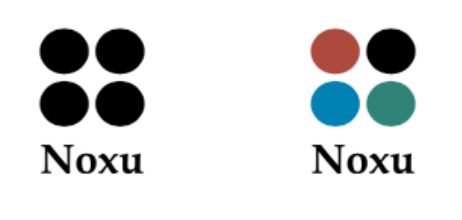
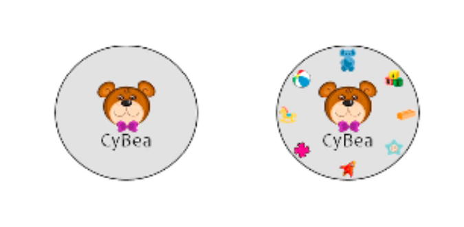
The figure below illustrates the types of logos that were most effective. We show two alternative logos for each of two companies that we presented to sample participants in our third study: the smart suitcase company and the toy rental venture. In both cases, the complex logo on the right attracted more investors willing to invest more money compared to the simpler logo on the left.


Takeaways for Entrepreneurs
Our research has some interesting takeaways for entrepreneurs and innovators who want to stand out among other new companies competing for equity investors on Kickstarter and other crowdfunding platforms.
First, pay careful attention to the visual cues you convey in connection with your venture. Even though logos are “low validity” cues that may have little or no correlation with venture survival or profitability, they still influence investment. In our study, for example, we found that the effect of logos was similar to the effect of higher validity cues, such as the number of previous pledges obtained, indicating the importance of a strong visual presentation. Don’t assume investors will look at “just the facts.”
Second, if you want potential investors to take a deeper look at your portfolio, create a logo that forces them to pause and process it. More colors, more angles and more visual elements are better. Resist the urge to go simple in order to appear hip and edgy. Our related research shows that most entrepreneurs gravitate to creating simple logos rather than complex ones. Bucking this trend may be a source of advantage.
Watch a Video
This video explains this article in about a minute.
Explore the Research
“What’s In a Logo? The Impact of Complex Visual Cues in Equity Crowdfunding,” Journal of Business Venturing, January 2019.
References
Baker, H. K., & Nofsinger, J. R. (2002). Financial services Review, 11(2), 97-116.
Cian, L., Krishna, A., & Elder, R. S. (2014). This Logo Moves Me: Dynamic Imagery from Static Images. Journal of Marketing Research, 51(2), 184-197.
Hirshleifer, D. (2001). Investor Psychology and Asset Pricing. Journal of Finance, 56(4), 1533-1597.
Luffarelli, J., Stamatogiannakis A., & Yang H. (2018). The Visual Asymmetry Effect: An Interplay of Logo Design and Brand Personality on Brand Equity. Journal of Marketing Research.
Stamatogiannakis, A., Luffarelli, J., & Yang, H. (2015). How to Use Visual Design to Boost Brand Equity. In R. Batra, D. Brei, & C. Seifert (Eds.), The Psychology of Design: Creating Consumer Desire: M.F. Sharpe Inc.
Sundar, A., & Kellaris, J. J. (2017). How Logo Colors Influence Shoppers’ Judgments of Retailer Ethicality: The Mediating Role of Perceived Eco-Friendliness. Journal of Business Ethics, 146(3), 685–701.


